Spatial Design & Architecture Studio AA4
QUIET, GIVEN FORM
AA4 Website Design, 2026
AA4 is an international spatial design and architecture studio that strips away the non-essential to reveal structural clarity, natural light, and the authentic identity of every space.
This website was built to carry that same discipline into the digital space. Instead of listing finished buildings, we structured the site so visitors first meet the way the studio sees space, then move into the work through a clear index, a single typographic scale, and motion slow enough to read as architecture.
AA4는 불필요한 것을 걷어내고 구조의 명료함과 자연광, 공간 고유의 정체성을 드러내는 국제 건축 스튜디오입니다.
이 웹사이트는 스튜디오가 공간을 대하는 태도를 그대로 화면으로 옮기는 작업이었습니다. 완공된 건물을 나열하는 대신 방문자가 스튜디오의 관점을 먼저 겪게 하고, 정돈된 인덱스와 하나로 통일한 타이포그래피, 건축처럼 읽히는 느린 모션을 통해 작업으로 들어가도록 구성했습니다.
[ Brand Identity ][ Web Design ][ Interaction ][ Framer Build ]
View live site[ 01 ]
Designing the Homepage as a Sequence, Not a Page
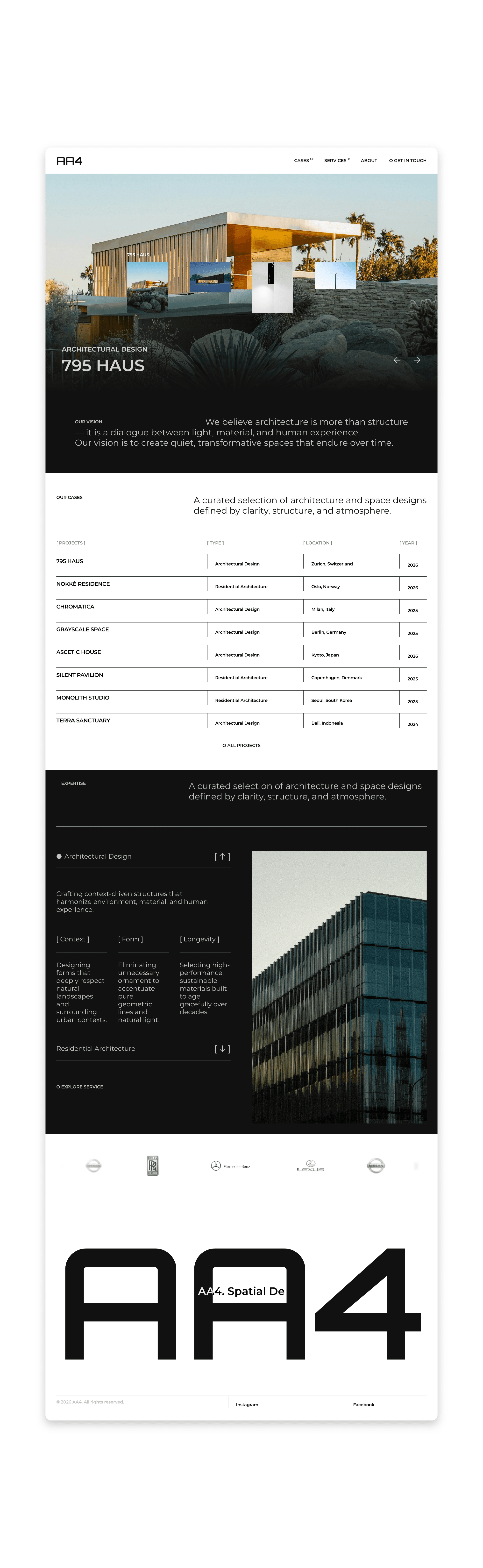
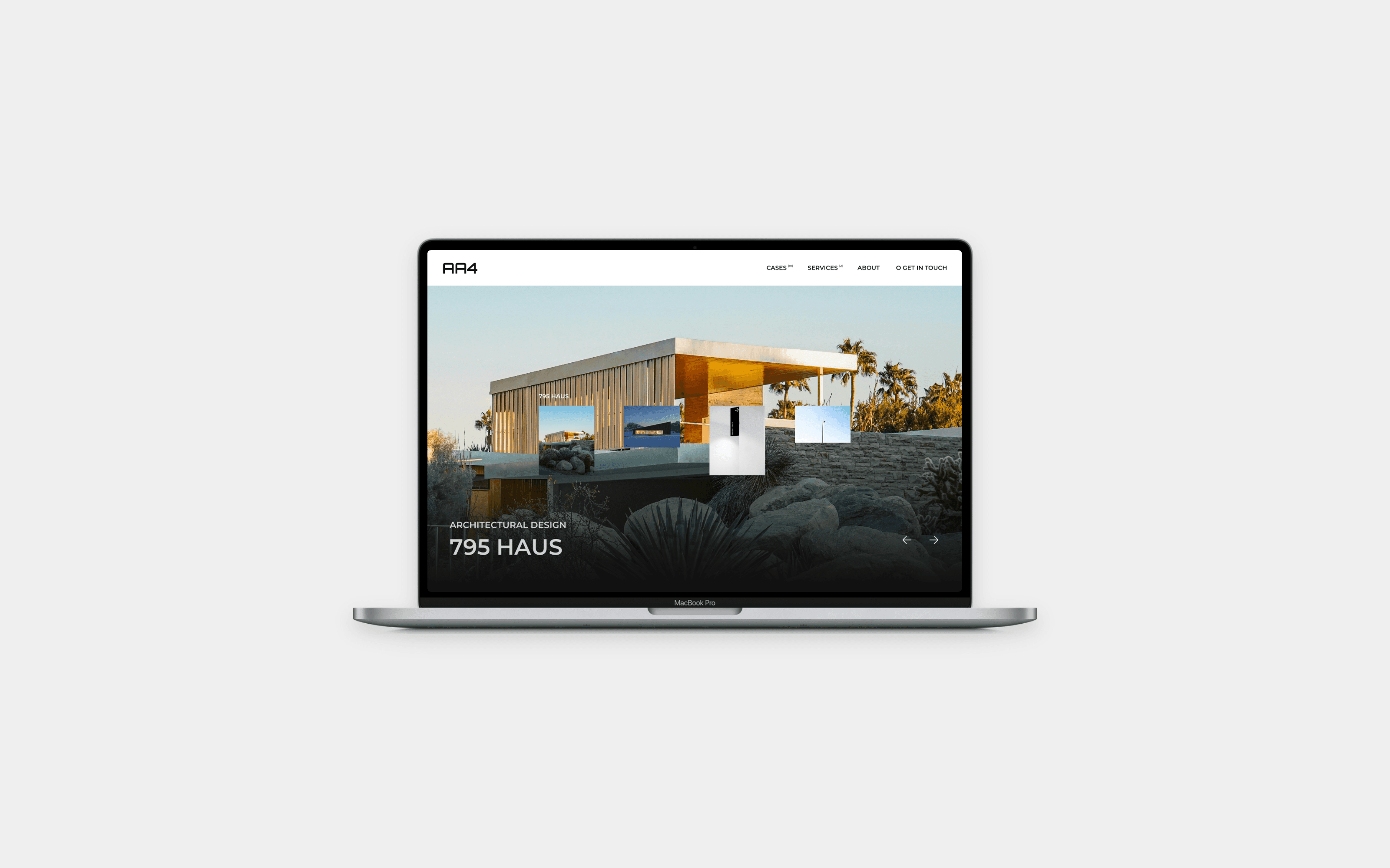
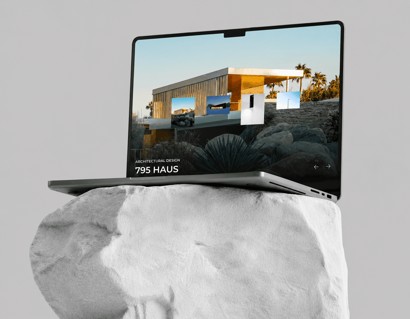
The homepage opens with a full-bleed slider in which the project title breaks into single letters and reassembles as the visitor scrolls. The motion was tuned to stay slow, so it reads as architecture rather than as an effect.
From there the sequence runs from vision to selected work to expertise. The brand impression, the portfolio, and the studio's method are understood in one uninterrupted descent, without asking the visitor to choose a path before they know the studio.
한 장의 페이지가 아니라 하나의 시퀀스로 설계한 홈
홈은 화면을 가득 채우는 슬라이더로 열립니다. 프로젝트 제목이 글자 단위로 흩어졌다가 스크롤에 따라 다시 모이며, 효과가 아니라 건축처럼 읽히도록 속도를 낮췄습니다.
이후 흐름은 스튜디오의 관점, 대표 프로젝트, 전문 영역 순으로 이어집니다. 스튜디오를 알기도 전에 경로를 고르게 하지 않고, 하나의 스크롤 안에서 브랜드 인상과 포트폴리오와 작업 방식이 차례로 이해되도록 배치했습니다.
[ 02 ]
Building a Visual System Around Structure, Light, and Restraint
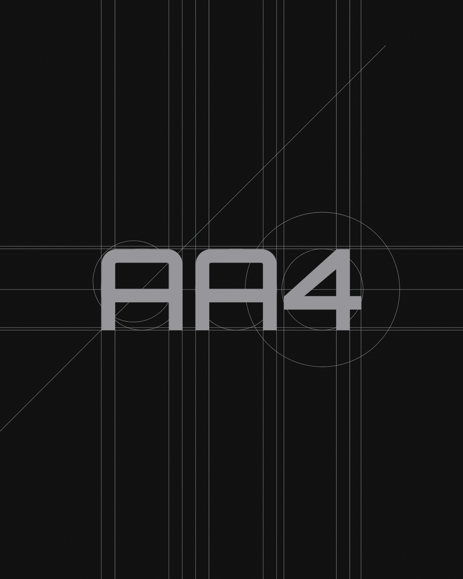
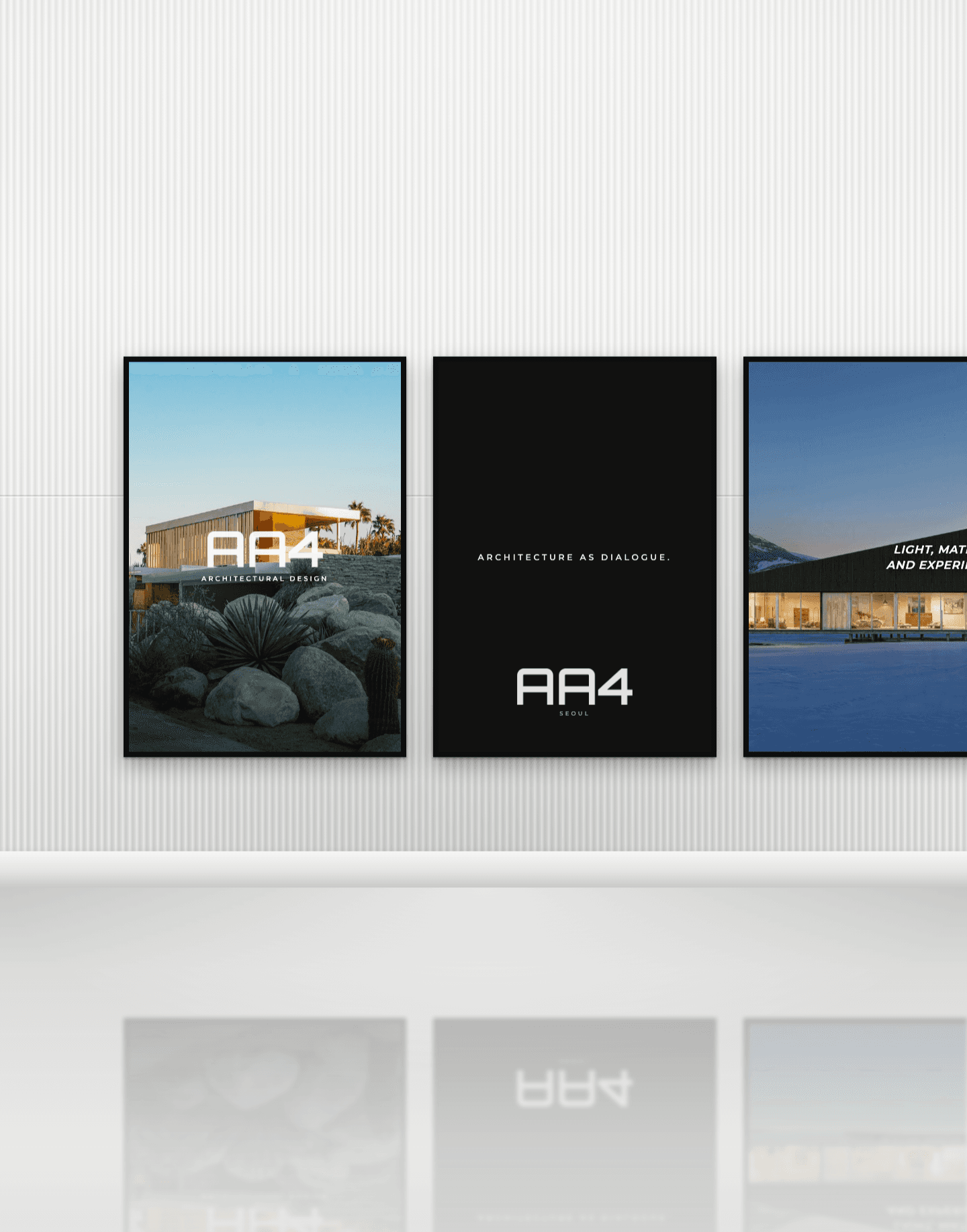
The wordmark was drawn on a geometric grid, using the same circles and axes an architect would set out on a plan. The four characters read as one constructed form, so the logo sits naturally beside the studio's own drawings.
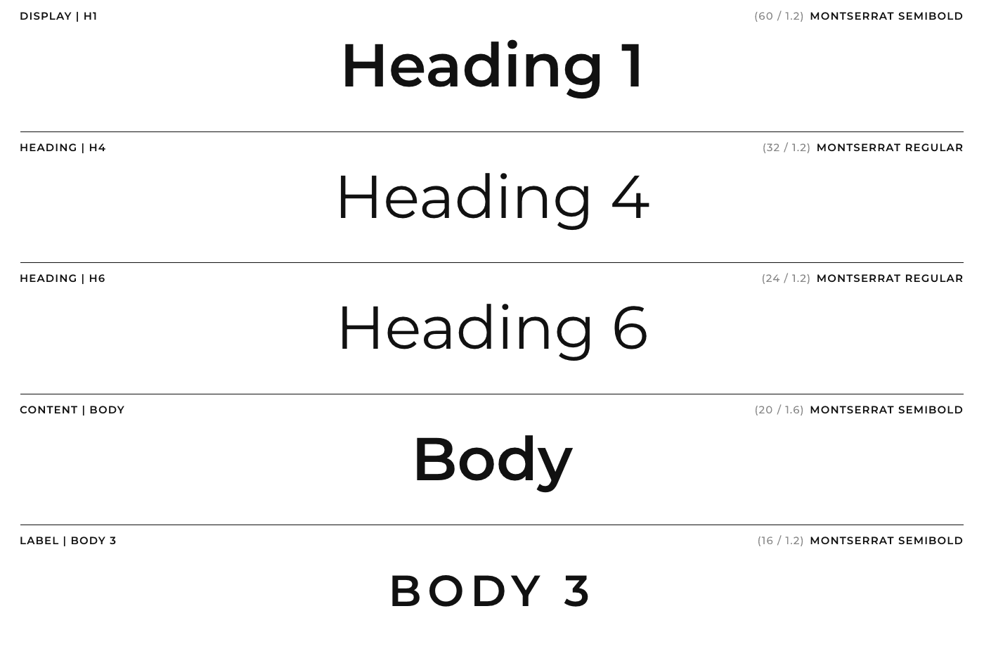
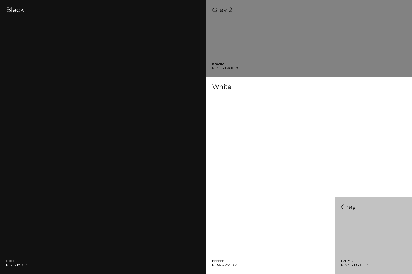
Typography and color were kept deliberately narrow. A single Montserrat scale carries every level of the interface, and the palette holds only black, white, and two greys, leaving photography of the spaces as the one source of color on the site.
구조와 빛, 절제를 축으로 삼은 비주얼 시스템
워드마크는 기하 그리드 위에서 설계했습니다. 건축가가 도면을 잡을 때 쓰는 원과 축을 그대로 사용해 네 글자가 하나의 구조물처럼 읽히도록 만들었고, 로고가 스튜디오의 도면 옆에 놓여도 어색하지 않게 했습니다.
타이포그래피와 컬러는 의도적으로 좁혔습니다. 몬세라트 하나로 전체 위계를 만들고 팔레트는 블랙과 화이트, 두 단계의 그레이만 남겼습니다. 화면 안에서 색을 내는 것은 공간 사진뿐이어야 한다고 봤습니다.
[ 03 ]
Turning the Project Archive into a Readable Index
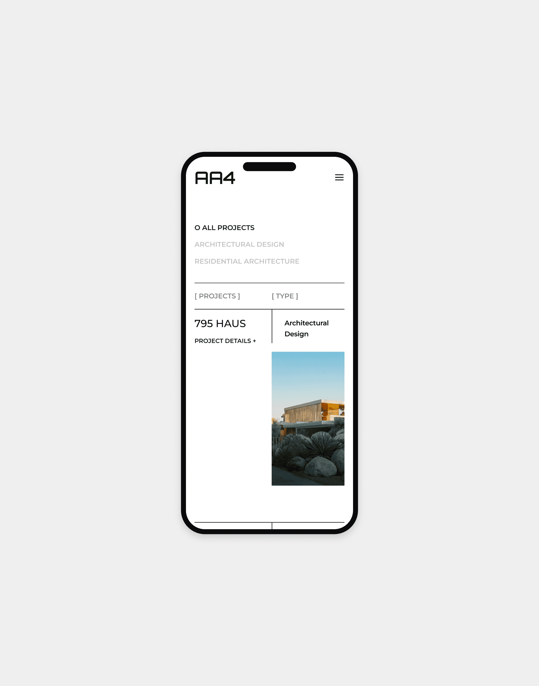
An architecture studio accumulates work faster than a gallery grid can hold. We replaced the grid with an index that reads like a drawing register, listing every project by type, location, and year on a single line.
Filters sit above the table rather than inside it, so narrowing by discipline never costs the visitor their place, and the preview image arrives the moment a row earns attention.
아카이브를 읽히는 인덱스로 다시 짜다
건축 스튜디오의 작업은 갤러리 그리드가 감당하기 어려운 속도로 쌓입니다. 그리드 대신 도면 목록처럼 읽히는 인덱스를 두고 유형과 지역, 연도를 한 줄에 정리했습니다.
필터는 표 안이 아니라 위에 두어 분야를 좁히는 동안 보던 자리를 잃지 않게 했고, 행에 시선이 머무는 순간 프리뷰 이미지가 따라오도록 했습니다.
[ 04 ]
Detail Pages Built on Each Project's Site and Narrative
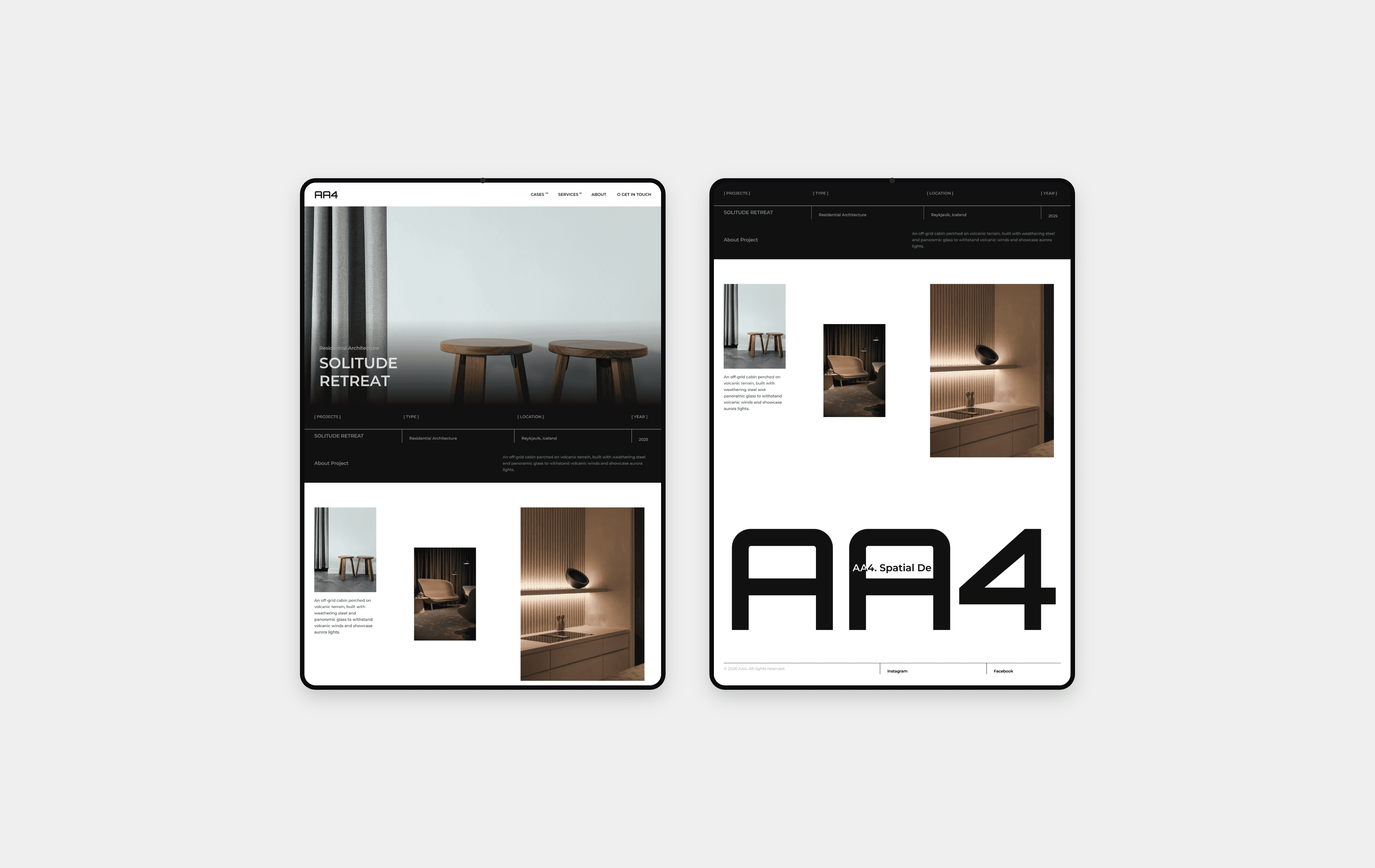
Each project page follows the way the space is actually entered, moving from the approach and the exterior to the interior and the objects that furnish it.
A fixed specification bar keeps type, location, and year in view while the images carry the atmosphere, so the page stays informative without breaking the mood it has just built.
장소와 서사에서 출발한 상세 페이지
프로젝트 페이지는 공간에 실제로 들어서는 순서를 따릅니다. 접근로와 외부에서 시작해 내부와 그 안을 채우는 사물로 시선을 옮깁니다.
유형과 지역, 연도는 상단 스펙 바에 고정했습니다. 이미지가 분위기를 끌고 가는 동안에도 필요한 정보가 항상 눈에 남도록 해, 정보성과 몰입이 서로를 깎지 않게 했습니다.
[ 05 ]
Carrying the Same Composure Across Every Screen
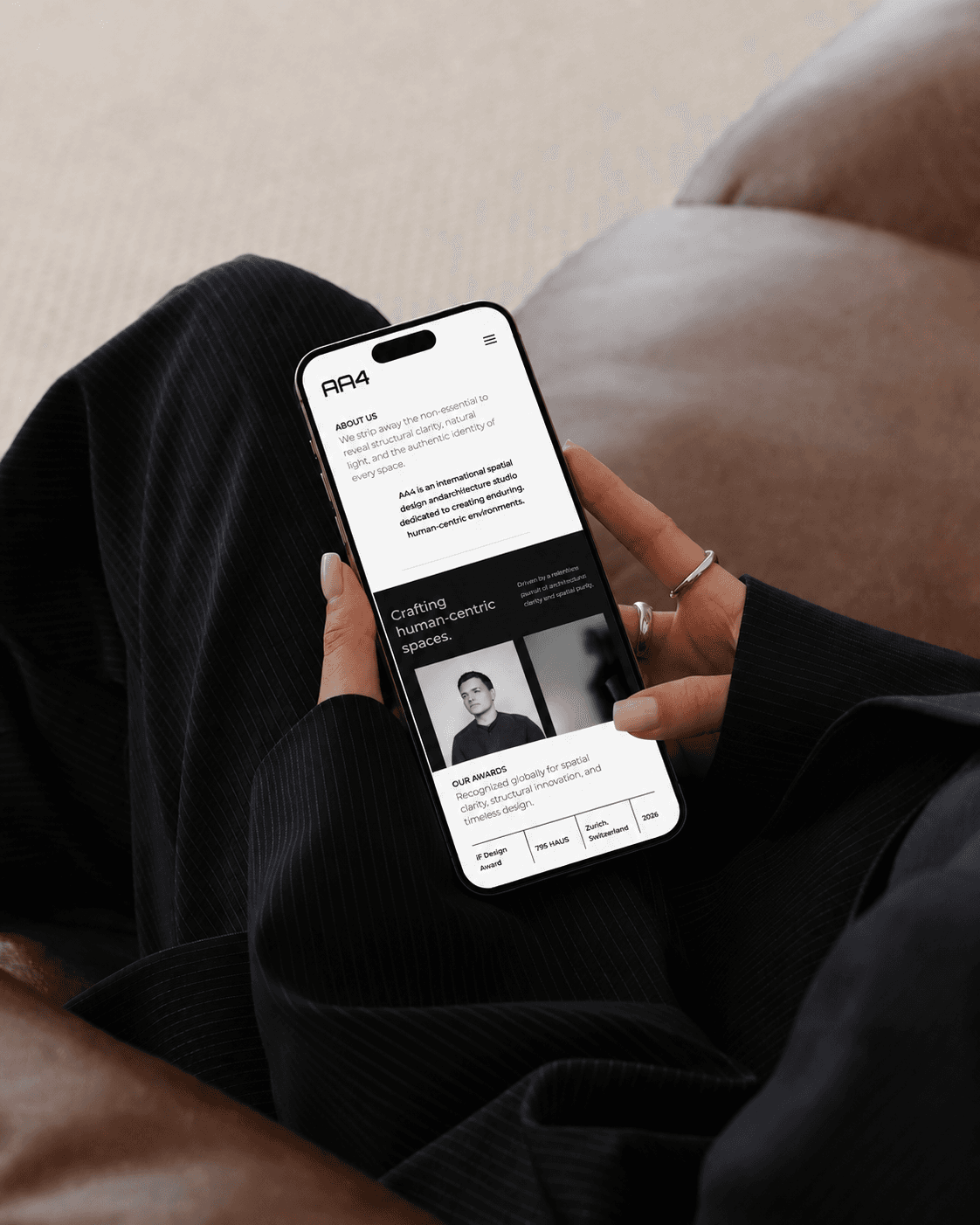
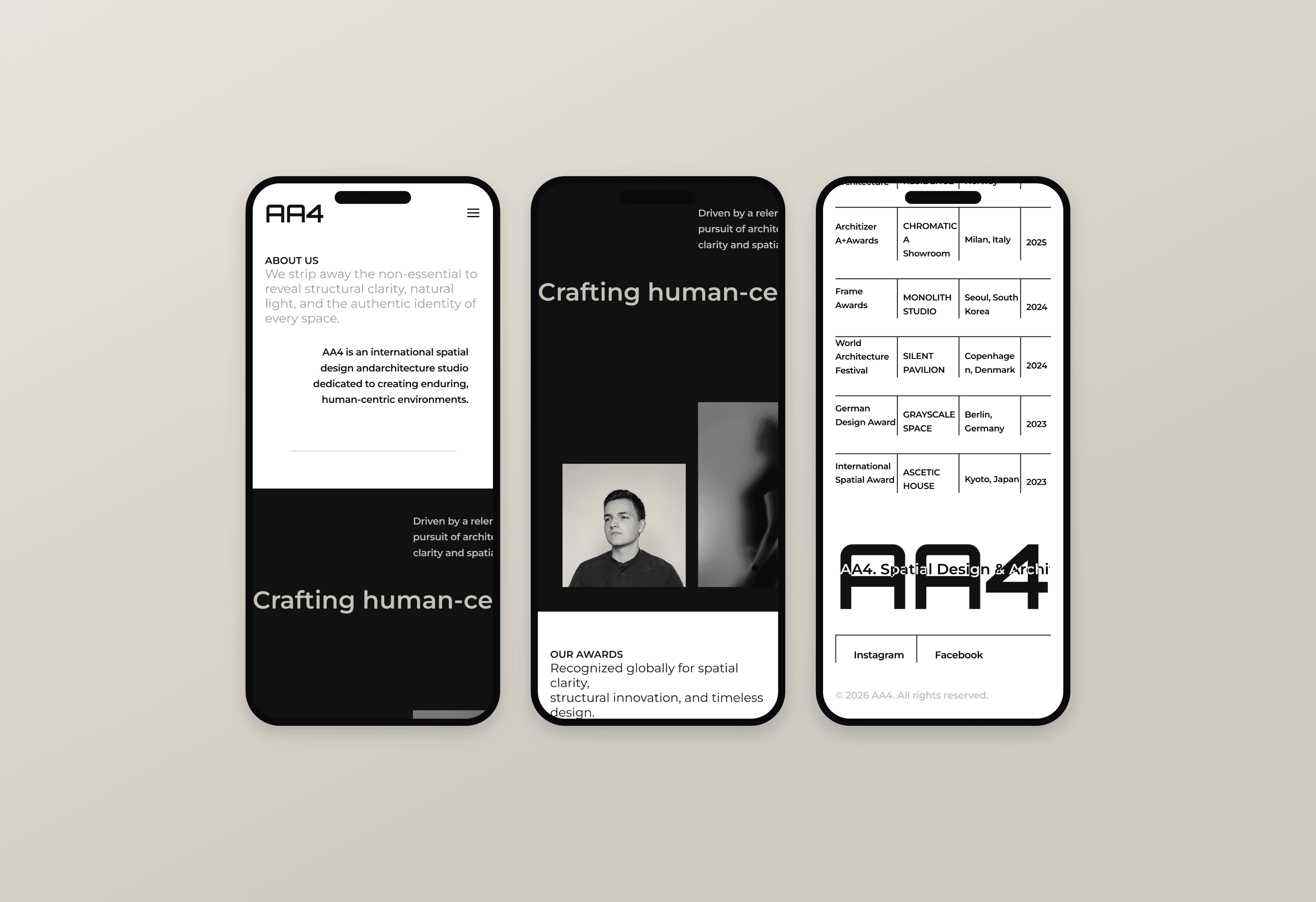
On mobile the layout collapses to one column, but the black and white blocks keep the rhythm they hold on desktop. The studio should read the same in a hand as it does on a wall.
Awards, profile, and philosophy were rebuilt as stacked blocks instead of compressed tables, keeping type large enough to stay legible while the structure of the grid survives the smaller screen.
어느 화면에서도 흐트러지지 않는 태도
모바일에서는 한 열로 접히지만 흑과 백 블록이 만드는 리듬은 데스크톱과 같습니다. 손 안에서 보든 큰 화면에서 보든 스튜디오의 인상이 달라지지 않아야 한다고 봤습니다.
수상 이력과 프로필, 철학은 표를 눌러 담는 대신 쌓이는 블록으로 다시 짰습니다. 글자 크기를 지키면서도 그리드의 구조가 작은 화면까지 남도록 정리했습니다.
[ 06 ]
Making the Inquiry the Quietest Step in the Journey
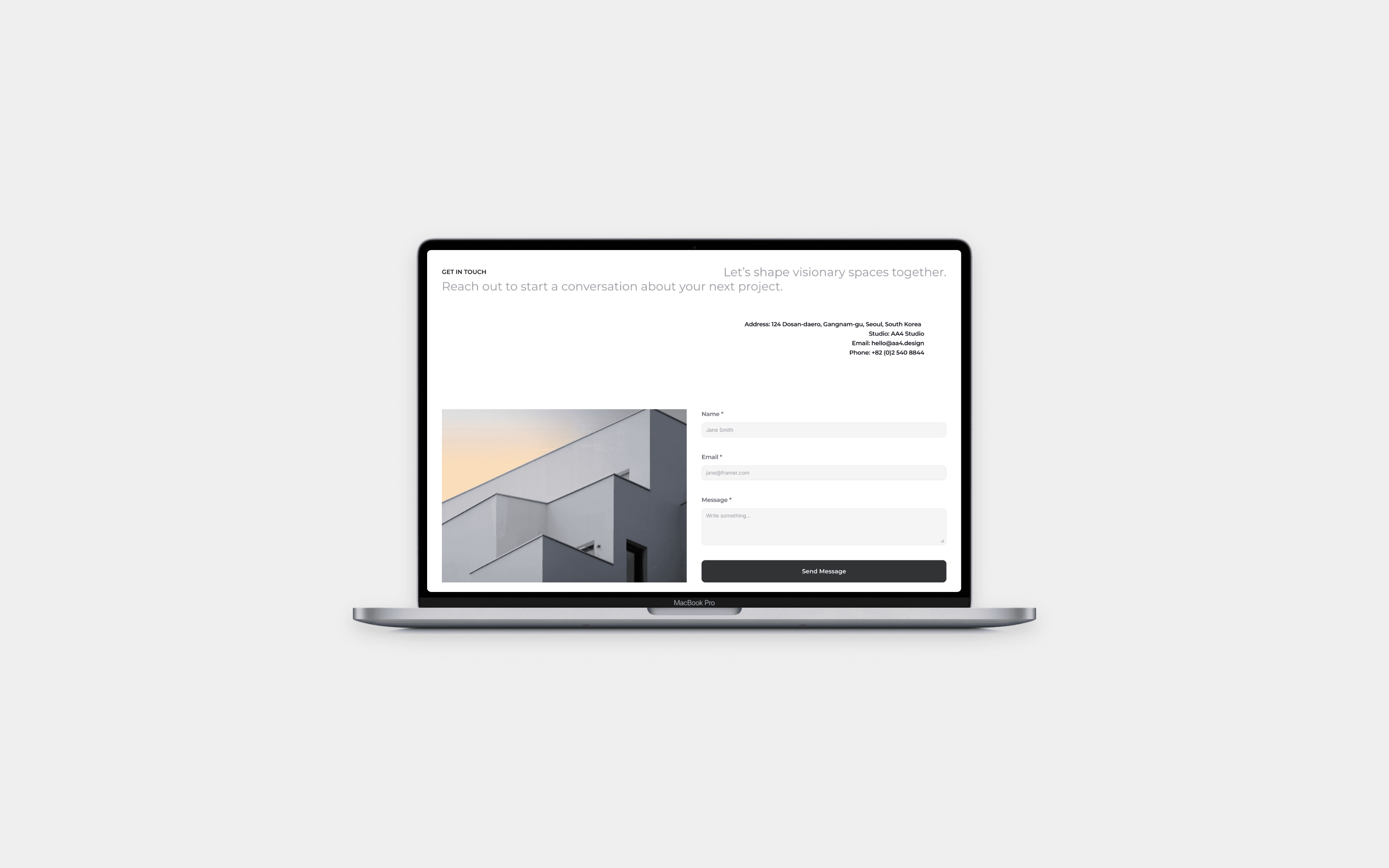
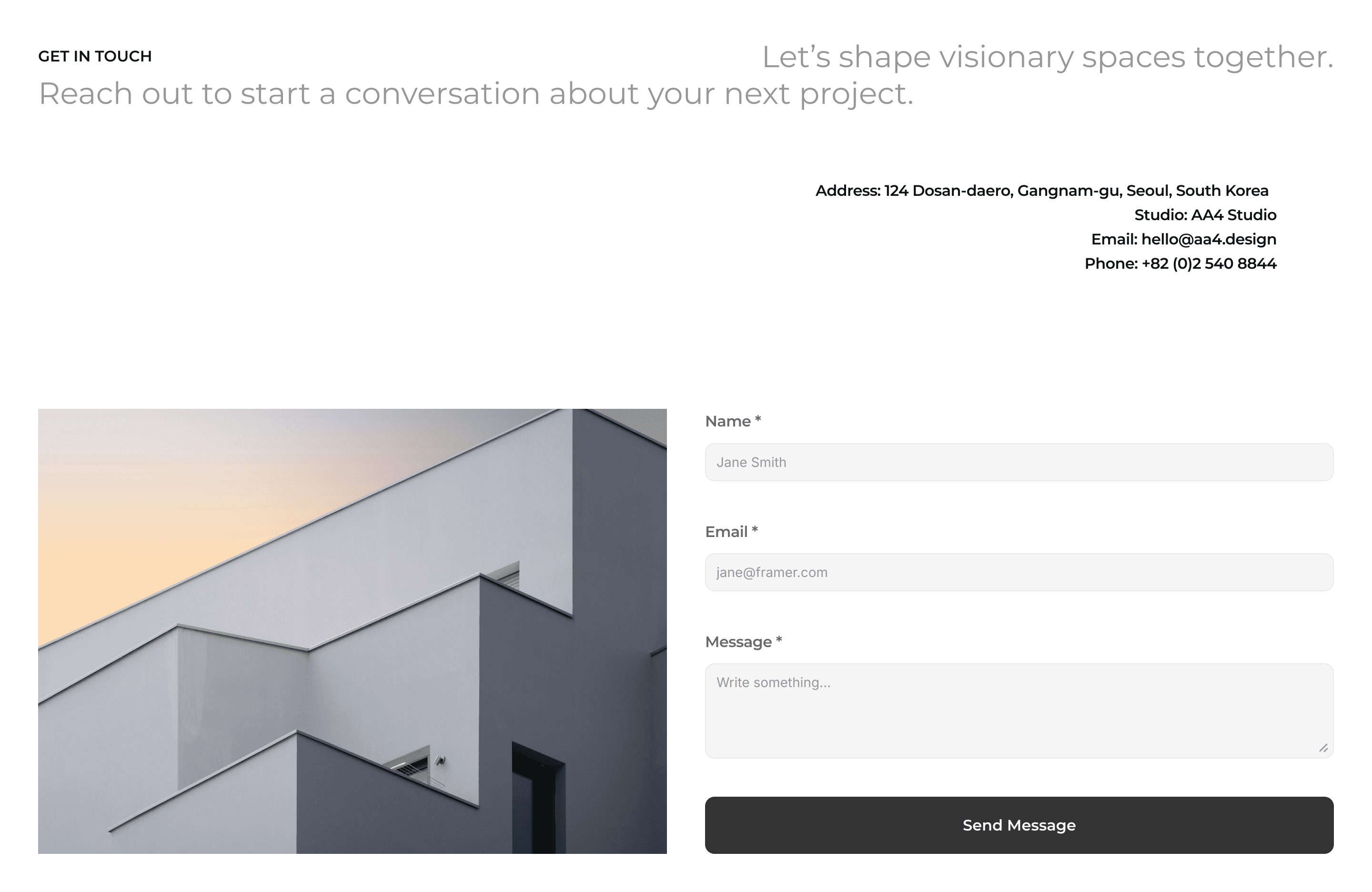
For a studio that works on commission, the contact page is the conversion point. We kept it to three fields and one sentence set against a single photograph, so that starting a project feels like the natural end of the scroll rather than a form to fill in.
Studio address, email, and phone stay open beside the form for visitors who would rather write directly.
가장 조용한 자리에 둔 문의 전환
수주로 움직이는 스튜디오에서 컨택 페이지는 전환 지점입니다. 사진 한 장을 배경으로 입력란은 세 개, 문장은 한 줄만 남겨 프로젝트를 의뢰하는 일이 양식 작성이 아니라 스크롤의 자연스러운 끝처럼 느껴지도록 했습니다.
직접 연락하기를 원하는 방문자를 위해 스튜디오 주소와 이메일, 전화번호는 폼 옆에 그대로 열어 두었습니다.